Have you ever had difficulties while surfing the web using your mobile device? Surfing the web on your mobile phone isn’t the same as surfing the web on your desktop computer just because a mobile phone browser sees a website in a different way. The inconveniences are mainly caused by the size of the page that is much larger than your screen. And though more and more people tend to use their portable devices in order to access the Internet anytime and anywhere, still a great number of websites are not mobile friendly.
I have noticed that web masters mainly prefer to use simple HTML codes to make a website to be displayed more or less correctly on mobile screen. But the best solution for it is to create a separate content for mobile phone users, as YouTube and Google have already done it. As the market of mobile devices that are capable of accessing the Internet is constantly growing, this time I decided to write a tutorial on how to create a mobile phone website on the basis of a pre-made web design.
Choosing a template design
Mobile templates presented at TemplatedBusiness correspond to the portable devices specific demands for the content and representation of information on the Internet and concentrate on the customers’ core requirements both in terms of usability and information. Well,
It is characterized by special mobile layout and is extremely light-weight (in several times lighter than usual template). It favours fast upload of the website content to the visitor’s mobile phone. As you might already notice, this mobile template is arranged vertically, what makes it look perfectly on the small screen. It is compatible with such platforms as Windows Mobile, Blackberry, iPhone, palm and symbian.
After purchase you will find HTML-version and source PSD file of the main page, fonts which are used in the template and some screenshots in the archive.
Template Customization
Now it’s time for the template customization. But if you feel that you don’t have enough knowledge or time to go though the whole customization process, you may take the opportunity to use Template Tuning services. Here you can order the template customization at an affordable price. Their web developers will easily and skillfully do all the necessary changes for you. But if you are not afraid of difficulties, then let’s go on! As it was said above, we will start from the HTML version.
To perform all necessary modifications you will need Adobe Photoshop CS+; Adobe Dreamweaver 8+ or any other HTML editor. Before you start you should install necessary fonts (usually they are placed in “sources/fonts” folder- in this tutorial you’ll find more detailed description. After that open .psd file in Photoshop and let’s learn how to make the necessary changes.
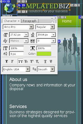
The first thing we are going to do is to modify the template header and a tag line. With the help of Horizontal Type Tool enter your company name instead of the default one and change a tag line. If the slice is not long enough and your site title goes out of its limits, don’t worry. You may easily resize the slice. For this choose the Slice Select Tool and highlight the logo (mouse left click + CTRL). By mouse left clicking stretch the slice borders.

The next thing that we are going to do is to edit another title on the Home page. Use Horizontal Type Tool.


Let’s customize the other pages. But before going further, you should define first what parts of the website design you need for your project.
About Us
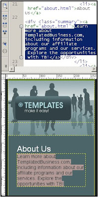
With the help of HTML editor customize all other texts and footer of this website design. Write down a full description of the products and services your company provides.
The same should be done with the other pages: Services, Solutions, Partners, Contact us and Privacy Policy. All actions should be performed in the same way, so I guess there is no need to repeat what has already been said above.
On the Contact Us page write your postal address and customize the contact form. For contact from implementation you need to have some PHP programming skills and while I don’t have them I recommend to order it from TemplateTuning website.
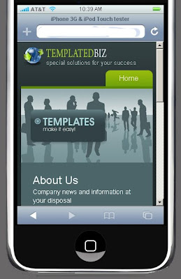
Well, the customization is completed. Take a look at the traditional format of this web design and compare it to the mobile format.
Mobile phone, Free mobile Templates, Sample Mobile Template,Create mobile Template, Website design, Mobile website Design


5 comments:
When developing your content for mobile users, be sure to make use of functions that make mobile phones different from desktop computers.
2d to 3d converter
On your main website, there should be a simple line of code that can be inserted into your HTML. You should have full control over the look and feel of the site to promote your brand to your potential customers.
Business Transformation
Clean up your content so your page will load faster more than a few images is not necessary.The best thing is to take the average phone connection speed and work with that.
words and music
Depending on the size of the phone's screen, it may layout the title and some necessary parts but usually not the whole page. If you can make it possible for the web page to fully appear on the screen then that would be a very promising product.
gift ideas for men
Post a Comment